Interview (in Serbian) for Dnevnik, a daily newspaper from Novi Sad, about the absurdity of contemporary branding.
The online version is available at www.dnevnik.rs/drustvo/macasev-apsurdno-brendiranje-srbije
Friday, December 30, 2011
Dnevnik Interview
Monday, December 26, 2011
ChromaTweet 1000
26 December 2011, the 1000th ChromaTweet.
1K ChromaTweet online sheet at www.chromatweet.com/1000
Monday, December 12, 2011
Friday, November 25, 2011
Joseph Goebbels™, Rhizome members exhibition
Joseph Goebbels™ (www.goebbels.info) as a part of Rhizome members exhibition by Jared Bertkowitz.
Jared Berkowitz explores self identity within modernity!
www.rhizome.org/artbase/exhibitions/view/1540
"Debuting at the Belgrade Summer Festival (BELEF) in 2005, artist Aleksandar Maćašev displayed Joseph Goebbels, a piece in which the Nazi leader’s face was reconstructed using popular companies’ logos. With the slogan “There is no truth”, the piece was distributed through billboards, posters, TV and radio commercials, and various internet campaigns. "If you tell a lie big enough and keep repeating it, people will eventually come to believe it." Joseph Goebbels compares current trends in mass communication with the propaganda practices of Nazi Germany. Though the truth is supposedly represented daily through the internet, television, and newspaper, one must take the intent of those providing the information into consideration. The modern “infosphere” that Maćašev describes is in truth filled with subjectively created information, based upon those in power in order to stay in power. Here we see that the commercialization of popular companies has come to dictate the flow of information available to the public."
Wednesday, November 23, 2011
Sunday, November 20, 2011
Michael Gee Icon

Related posts:
Steve Cards
Personal cards (update)
Wednesday, October 19, 2011
30 February
Book cover for "30 February", a new novel by Jelena Đurović.
Published by Znak Sagite, 2011


First page illustration
Tuesday, October 18, 2011
Tihany Design website


www.tihanydesign.com
art direction: Mirko Ilić
design: Aleksandar Maćašev
programming: Tomica Orešković
Sunday, October 16, 2011
Thursday, October 06, 2011
Margins at 'La Casa' art show in Verona, Italy.
33 Margins piecesare featured at the show.
La Casa, Young Serbian Artists
Verona, Galleria d'Arte Moderna Palazzo Forti
7 October 2011 - 29 January 2012
Curated by Aurora Fonda and Zara Audiello


Margins art blog project www.macasev-margins.blogspot.com
All the pictures from the show featuring Margins www.flickr.com/photos/macasev/sets/72157628015932047
Wednesday, September 28, 2011
Typography Sketchbooks feature
A four page feature in "Typography Sketchbooks" by Steven Heller and Lita Talarico.
Hardcover: 368 pages. Publisher: Princeton Architectural Press, 2011.
"Nearly 120 of the world’s leading typographers and graphic designers open up their private sketchbooks to reveal their creative processes.
Arranged by designer, this collection reveals how the world’s top typographers and designers strive to find new and exciting ways of communicating through letters and words.
Contributors include both the world-renowned – Milton Glaser, Erik Spiekermann, Peter Bilak and Jean Baptiste Levée – and the up and coming."
from Thames&Hudson

Aleksandar Maćašev was born in Bečej Yugoslavia, and graduated from the Faculty of Architecture at the University of Belgrade. A designer and typographer, he works in a variety of disciplines. Most of or the time his sketching is visual play with no purpose: "An old typeface catches my eye, usually from some movie credits or a street sign. Or I want to note something down, but I also want to add some graphic quality to it - a quote, a thought, or a name that I want to remember. I often use hand-drawn slides when I give lectures and presentations. They offer a lively contrast to the usual computer generated type."
Maćašev says all of these sketches are finished. "Let's define a sketch," he posits. "Sometimes sketches are used to find a solution or they can also be graphic pieces that have sketchy qualities. These tend to be finished work, where I consciously decide to keep the unfinished, sketchy quality" In fact, he says many sketches are more finished than not. "It's funny when you look at a lot of recently published books of working sketches. They all look quite cool and polished. Artists and designers seldom publish their really messy working sketches that show the process of making things."
Links to the work featured in the book:
Poster 2009
Older work of mine often looks like... to me. (Margins)
Dad? (Margins)
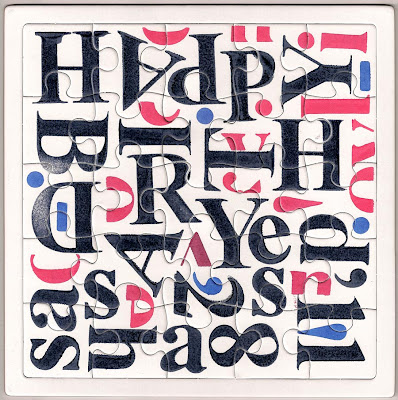
Happy Birthday (Margins)
I've seen things you people wouldn't believe (Margins)
Moleskine Type Sketches 1
Moleskine Type Sketches 2
Amazon.com link
Thames&Hudson link
Monday, September 26, 2011
Wednesday, September 21, 2011
ChromaTweet at the Dumbo Arts Festival
A physical outgrowth (300 ft long outdoor print) of the ChromaTweet project at the Dumbo Arts Festival. Presented by ArtBridge.

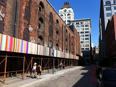


The piece is installed in Dumbo neighborhood of Brooklyn, on Water Street (between the Old Dock St and Main St).
Google map link: http://g.co/maps/dnwz3
More details about the ChromaTweet print at www.chromatweet.com/chromatweet-outgrowths.html
Thursday, September 08, 2011
Feature in "Znakovito 3"
www.znakovito.com/znakovito

T-shirt design. 'Product', 2010.
www.macasev-t-shirts.blogspot.com/2010/06/product.html

Logo for Atelier Varan, 2004
Monday, August 29, 2011
2011 Summer T-Shirts


The Closet of Dr. Caligari, Vertigo, Mr. Humphries and Waiting for the Sun.
Vertigo tote bag.
Silk screen print.
www.macasev-t-shirts.blogspot.com
Wednesday, August 24, 2011
ChromaTweet.com

The ChromaTweet project has got a new home at www.chromatweet.com with the complete archive, news and outgrowths.
Monday, July 25, 2011
Vital Signs, illustrations
24 illustrations for Tessa McWatt's novel Vital Signs.
Illustrations No. 2 and 6
The main protagonist Mike (graphic designer) is trying to communicate with his sick wife through the language of visual signs he devised. She suffered a stroke and that seems the only way to reach to her. As the novel progresses the signs, fully integrated into the plot, are becoming more expressive and intimate and less clean and universal. Written by Tessa McWatt
Illustrated by Aleksandar Macasev
Category: Fiction
Format: Hardcover, 176 pages
Publisher: Random House Canada
Pub Date: July 26, 2011
Random House catalog link
Amazon.ca link
Reviews:
National Post
Mike’s exquisitely articulate illustrations, which are scattered throughout, make the novel a visual treat.
The Globe and Mail
These cold little graphics are usually seen on bathroom doors or traffic signs, and are rarely used to convey emotion. But it’s to illustrator Aleksandar Maćašev’s credit that he succeeds in doing so, and invests this rather sad story with much humour into the bargain.


